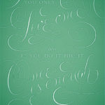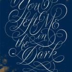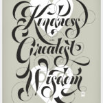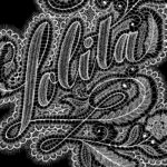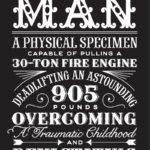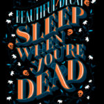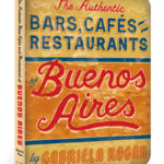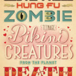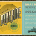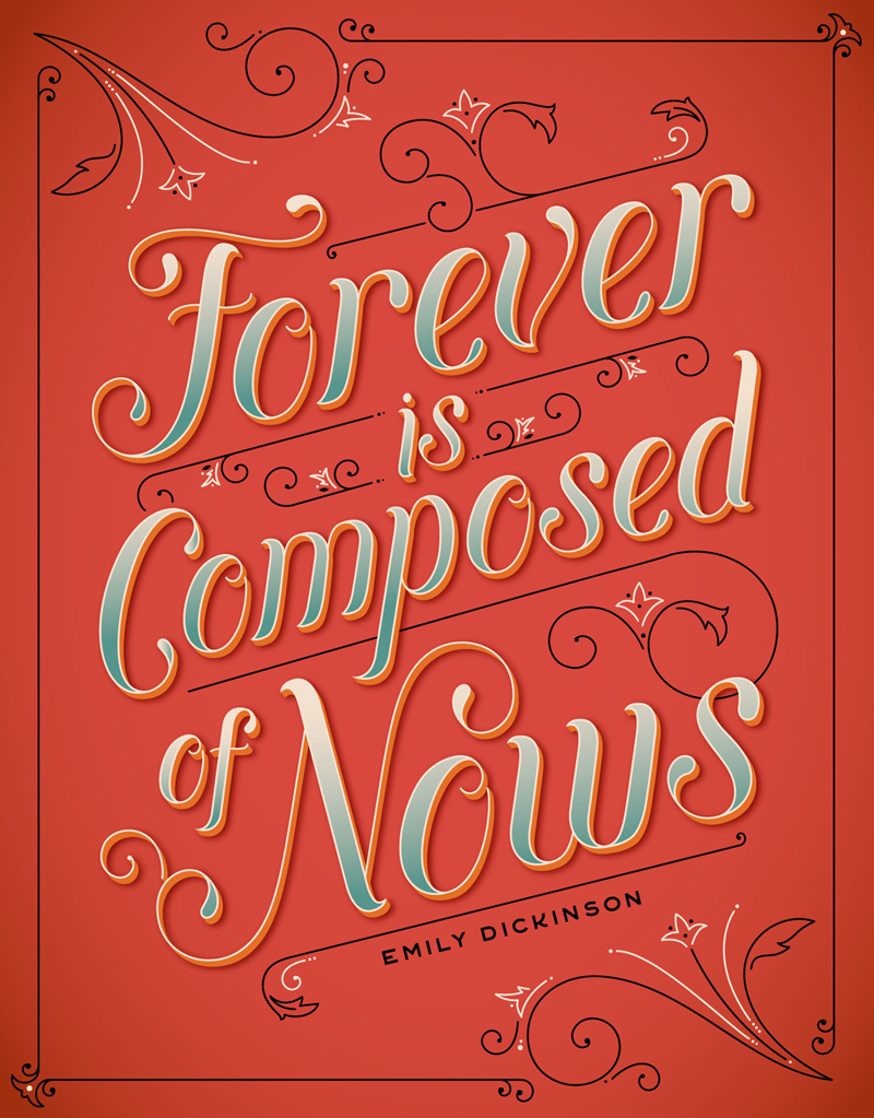
In the global design community there are a metric fuck ton of amazing designers but one in particular stands out among the others. Her name is synonymous with amazingly detailed custom lettering and typography and some of the best you’ll see in this modern age. She is Jessica Hische and we all wish we were her.
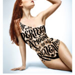
In the past couple of years strong typography and hand lettering have been making a real comeback in design and is becoming quite popular. Back in the old days hand lettering was the only alternative to using a standard font you would find on a press (which there weren’t that many). When computers began to take over, fonts became more readily accessible and now number in the millions with endless possibilities. With all these new possibilities and programs design became cluttered as we tried to fit as many “cool” things on a page as we could. Now design has reverted back to its vintage roots and is simple, clean, and full of some amazing typography.
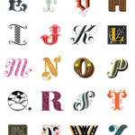
Jessica Hische is at the forefront of this typography movement. It all started when she didn’t want to pay for the hefty price tags of an already existing font, so she created her own. She launched her blog, The Daily Drop Cap to showcase her incredible skills one letter at a time. It was a huge success and sky rocketed her into design stardom.
She has been a huge inspiration to me and I’ve even started creating my own hand lettering and I’m loving it! I truly aspire to be in her shoes and want nothing more than to be a recognizable name in the lettering world. It’s a tough thing to do but I will keep working hard towards that goal and I will succeed.
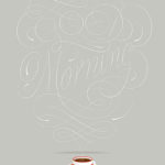
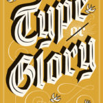
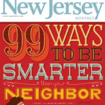
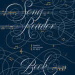
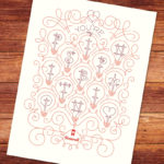
So even if you aren’t in the design field you too can also find inspiration in Jessica’s incredible work. She has a ton of work on her website but I have compiled what I feel connects to my work best and the most inspirational. Feel free to browse whenever you have designer’s block or just really need something pretty to look at. Enjoy!