Recently I met up with a group of friends including my friend Aimee for dinner at Four Peaks Brewery. I recently designed Aimee’s entire wedding suite and shot the photography for her wedding. She was showing off her invitations to some of her friends and when they started asking about who designed them she pointed over to me and said “Well actually my designer is right here.” Come to find out, I was exactly what they were looking for.
Nathan and Brooke for the past year have been planning their food truck business, The Roasted Shallot. They have been married for 9 years and worked together for over 7 so going into this together was a no brainer for them. They were right on the edge of purchasing a truck really the only thing left was an identity.
We all met up for coffee and discussed the possibility of working together. First of all they needed a logo and they came prepared with what they are looking for. They definitely wanted to include a shallot in the logo and in their detailed notes they wanted earth tones, colors of the shallot, they wanted it to be hip, modern and casual with possibly graffiti style lettering and/or sans serif.
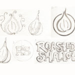
After that meeting I began my research including my clients every step of the way using Pinterest to post what I had found. When I completed a few sketches we met again for drinks this time and really got to talking about who they are and what they want The Roasted Shallot to stand for. The food trucks of Phoenix are not up to the standards of other cities such as LA or Miami and the laws hold them back. Currently food trucks are only allowed to park on private property with permission or at an event that is serving food. These laws need changed.
I have always been a huge supporter of food trucks and especially local food. Food trucks are less expensive then having a brick and mortar store and are able to travel anywhere making it more efficient. Generally they provide inexpensive delicious faster better food to a gathering hungry community. Right now Phoenix has food truck fridays where they all rally up but frankly there aren’t that many and they’re not all that good.
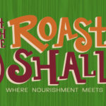
After a few more rounds and tons of round logos we decided to ditch the round idea and revert back to an earlier version we love that includes some of my own lettering. The look of the shallot turned out exactly how they had envisioned and we all couldn’t be happier with how the final logos turned out.
The truck has now been painted and all that is left is getting the decals applied. Stay tuned for that post after I photograph the truck. I also recently worked on designing their website with my friend Jeramy coding it. It’s just about finished but you can view our progress so far.


